
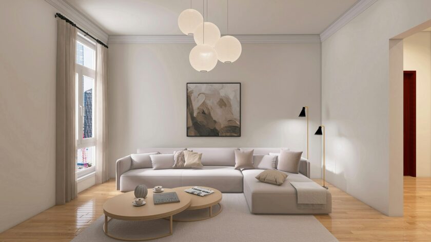
The Art of Minimalist Decorating: How to Curate a Space That Feels Personal
Many people have negative perceptions of minimalism. They imagine empty rooms with white walls, just a black chair, and a lot of stress. However, that kind of minimalism that you see in architecture magazines is not what most people imagine. What they actually have in mind is a house where you can breathe, relax, and where it’s still yours. No one wants sterile. They want serene.
The only difference between sterile and serene, is intention.
Start with anchor pieces, not rules
Most of the advice people get about decorating starts with subtraction. What are you going to get rid of? That’s not wrong, but it’s a miserable place to start a project – by defensively scanning rooms for things that are annoying rather than by asking a positive question: What’s beautiful enough that it deserves to stay?
So instead, start by identifying three things in each room that you pretty much never want to get rid of. Something important, or something you really love, or something you worked really hard to acquire. Could be an old credenza you inherited from a family friend, or a painting you bought on vacation, or a really nice lamp you saved up to get. These are your anchor objects. Everything else in the room is there to showcase those anchors, or it’s out. It turns the project from “already having less” to “showing more”, which is a way better thing to do.
Once you’ve gotten clear on what those three things are, it becomes easier to start curating in the rest of the room. You don’t have to make random calls about whether things are clutter. You’re simply deciding whether or not they are good enough to share a room with something you really love.
Texture is how minimalism stays warm
An all-white, monochromatic color scheme creates a soothing aesthetic. However, if every surface is smooth and flat, soothing can easily turn into cold and sterile. This is where texture comes in.
A chunky knit throw casually thrown over the back of a sleek leather couch. A rough-hewn, reclaimed wood side table paired with a clean-lined, neatly tailored couch. Wool, rattan, ceramic, brushed metal – these aren’t extra details and embellishments. These are the textural elements that make the difference between a room where you can almost feel the static on the digital surfaces, and one that invites you in with all the scent, warmth, and tactile allure of the real world.
The key here is contrast, not clutter. One rough surface for every smooth one. One matte finish for every reflective one. Minimalism isn’t about deprivation; it’s about careful consideration of every element that goes into a room.
Designate zones for personality
One of the reasons why people don’t embrace minimalism is because they are afraid they will have to part with their collections, books, and small sentimental items. The truth is you don’t have to do that. You just have to find the right place for them.
Select two or three surfaces in your room and think of them as “personality zones” – a bookshelf, a mantelpiece, or a console table. You can display anything you like on those surfaces. In areas other than those, keep surfaces empty. This concept will help you turn your collections into a well-thought-out display rather than clutter, and it also provides a space for your eyes to rest in between.
A gallery wall also functions based on this concept. Instead of hanging framed pictures all over the place, arrange them neatly in one spot. The free space around them does not mean there is nothing there. It actually helps your gallery get noticed.
Quality over quantity is a real investment
There’s a financial argument for this approach, not just an aesthetic one. High-quality interior design and considered curation can increase a property’s perceived value by up to 17%. That’s not an argument to decorate for resale – but it does reinforce something practitioners in design have always known: quality reads.
A single artisan-made piece of furniture with real material and honest construction does more for a room than four mass-produced alternatives that are already starting to wobble. Heritage furniture gains character with age. Fast furniture just ages.
When studying how this translates into actual spaces, looking at how high-end residential properties balance restraint with warmth is genuinely useful. The Berkeley is a strong example of how modern architecture and warm, personal interior choices can coexist without either cancelling the other out – the kind of reference point worth bookmarking when you’re trying to calibrate your own rooms.
The one-in, one-out rule keeps it honest
Even with the best intentions, minimalist spaces accumulate. A candle here, a throw pillow there, a small plant that has three friends by spring. None of those individual additions are wrong. The drift is the problem.
A simple one-in, one-out rule for decorative accessories keeps the atmosphere from slowly eroding. When something new comes in, something goes out. Not as punishment – as maintenance. It forces a genuine question each time: is this new thing better than what’s already here? If yes, bring it in and let something else go. If no, leave the room as it is.
This habit is what separates a home that was designed once from one that continues to feel considered.
Warm minimalism isn’t a style – it’s a practice. It asks you to keep paying attention to your space the same way you paid attention when you first put it together. Do that, and the home doesn’t stop feeling personal. It gets more personal over time.